"Thanks to Nathan for inviting me to share my thoughts on his blog. Nathan and I share a number of aesthetic interests, including a love of aerial landscape imagery, so maybe it is appropriate that I started writing this entry while on an airplane, high over the Atlantic. My wife and I were returning from a trip to Denmark, where we attended a friend’s wedding, and London, where we checked out some East-end galleries. So my head is full of Danish modernism, Brick-Lane curry, and the art I saw on my travels.
Now that I’m back in NYC, I’m in crunch-mode, starting the final few paintings for my upcoming show (entitled Fade, opens Sept 11 at Like the Spice Gallery. This work is about the desert, and my feelings about growing up in the waning aftermath of the Cold War. I’m using aerial imagery of desert weapons sites, e.g. Nevada Proving Grounds and the Hanford Site in Eastern Washington. I’ll start out with a couple shots from my studio, so you can see where I’m coming from:
 (seen in studio below Yellow Plume; Laser Interferometer Gravitational-Wave Observatory, Oil on linen, 2009. 60 x 40 inches)
My studio, last I looked, including a blank canvas waiting for my input. Following are my thoughts, in no particular order…
1) Color
The underlying theme in all of my work is color, and the colors I’m thinking about now are the colors of the desert steppe in southeastern Washington State, where I grew up. The steppe is huge, punishingly hot, and desolate – all of which I find beautiful. Two interesting things about the steppe around my home town:
• The dunes were formed by massive cataclysmic floods
• It is home to the Hanford nuclear site
In other words, the landscape was formed by two major traumatic events, one natural, the other man-made. The pictures above give you an idea. The white structures are giant sand dunes kicked up by the last massive flood around 14 thousand years ago. The natural colors revolve around the grays of the sandy landscape, with ochres, atmospheric mauves and the crystal blue of the desert sky.
2) William Turner
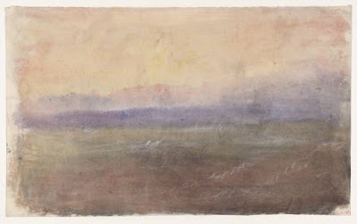
 J. M. William Turner (1775-1851), A Stormy Coast, circa 1820-30, Gouache, pencil and watercolor on paper, 27 x 45 cm, Tate, London
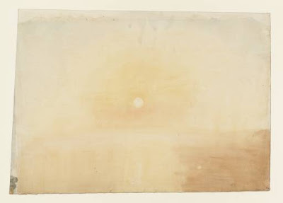
 J. M. William Turner (1775-1851), Sunrise, circa 1825-30, Watercolor on paper, 33 x 47 cm, Tate, London
While in London, I was lucky enough to catch a show at the Tate Britain which matched up the more abstract work of William Turner with Marc Rothko. You can’t talk about color in the landscape without talking about Turner, known for abstracting his vistas into vibrant, impressionistic swirls. I was particularly taken by a couple of pale but lively watercolors.
3) Gerhard Richter
 Gerhard Richter, Mustang Squadron (Mustang-Staffel), 1964. Oil on canvas, 34" x 59", The Museum of Modern Art, New York.
 Gerhard Richter, 866-2 Abstraktes Bild, 2000, Oil on canvas, 78” x 63”, Miriam Goodman Gallery, New York
I work simultaneously with representational imagery and abstract fields of color, and it won’t surprise any of my peers that Richter is a big influence. Richter demonstrated that one could combine these two distinct and seemingly oppositional aesthetic modes within a consistent conceptual framework. My work essentially builds off of the same idea, although, of course, my paintings come out looking quite different.
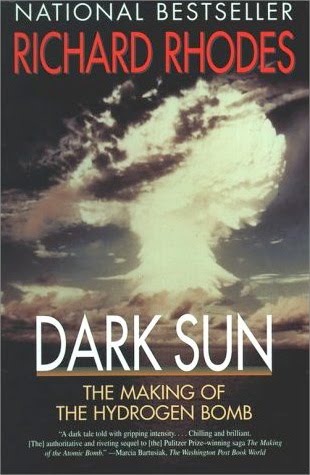
3) Dark Sun: The Making of the Hydrogen Bomb, by Richard Rhodes
 While researching my show, I read this outstanding book. It tells the genesis story of the development of thermonuclear weapons in gripping, dramatic, and sometimes terrifying detail. Some of that development took place at the aforementioned Hanford site; engineers at Hanford created the plutonium for the Nagasaki bomb and for the US arsenal throughout the 1950’s and 60’s. Although the site was switched over to environmental cleanup in the 80’s, the remains of the nuclear hey-day are still scattered throughout the landscape in the form of decommissioned reactors and waste burial sites. Above is an image I took of sealed submarine reactors being buried in the dunes, an indication of the vastness of the cleanup/decommissioning effort.
4) Department of Eagles – in Ear Park
 The sparse, low sound of this album became something of a soundtrack for me in the studio this year. I like the DoE’s directness, and their use of a few rich sounds within simple, minimalist compositions. Music can be hard to describe in words -- the sound either hits you or it doesn’t. In that way it is a lot like color.
5) Chromophobia , David Batchelor

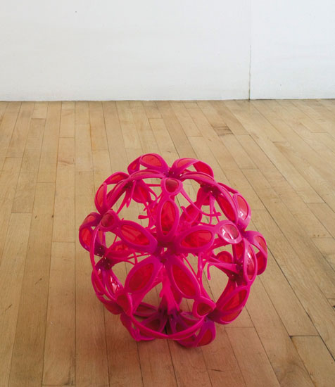
David Bachelor, Eyeball 4 (pink), 2007, 30 pairs plastic sunglasses, 30 cm diameter, Wilkinson Gallery, London
If you’re an artist thinking seriously about color, you are going to love this book - Chromophobia, by David Bachelor. The basic thesis is that color has been marginalized by western culture, in favor of a puritanical concept of white or whiteness. (Think of the supposedly neutralizing aura of a white cube gallery, or the Orwellian quality of the interrogators bare white light bulb.) I’m still caught up in a quote from the second chapter, where Batchelor quotes the 19th century French Critic Charles Blanc:
The taste for colour, when it predominates absolutely, costs many sacrifices; often it turns the mind from its course, changes the sentiment, swallows up thought.
Blanc seems to have meant that comment negatively, that color is a perversion, a deviation from some kind of true path in civilized art (no doubt represented by the linear, narrative styles espoused by French Academies at the time). But to me that quote sounds like a step in the right direction, especially the ‘swallows up thought’ part. After reading his book, I was gratified to see the chroma-friendly sculpture by Batchelor, pictured above, which is made out of bright pink plastic sunglasses.
6) Tillman Kaiser

 Tillman Kaiser, Untitled, 2009, Tempera and silkscreen on canvas, 55 x 40 cm, Wilkinson Gallery, London
 Tillman Kaiser, Untitled, 2009, Tempera and silkscreen on canvas, 55 x 40 cm, Wilkinson Gallery, London
I’ll round up this blog entry with some work I saw Wilkinson Gallery, in London’s East end. The artist is Austrian, educated in Vienna, and hasn’t quite yet made the jump across the pond. His paintings somehow manage to reference Salvador Dali via an angular, modernist style which reminds me of Mark Grotjahn. Anthony Wilkinson was nice enough to pull out a couple of recent works on canvas. The first image is of two of the smaller paintings leaning against the gallery’s back-room windows, which overlook the street below."
Eric LoPresti is an artist living and working in New York. More works from his upcoming show are available on his web site at www.ericlopresti.com.
Thanks Eric!


No comments:
Post a Comment