Showing posts with label minimalism. Show all posts

Thursday, January 31, 2013

New work by Ane Graff


 Your Groundwater. Ane Graff

Opening Saturday February 2 at 14.00 p.m.
The exhibition will be opened by Karin Hindsbo, dir. Sørlandets Kunstmuseum,
and will be on display until April 28th 2013. A new essay by Norwegian writer Johanne Nordby Wernø on Ane Graff's art will be published especially for this exhibition.


You can view more of her work on my blog here - including a short interview she did with me way back in 2008.

Friday, October 21, 2011

Sergej Jensen


Recent works by Sergej Jensen - very inspiring lately. See more here and here.

Sunday, April 3, 2011

Minmal Abstraction - Old and New

I saw a lot of minimal abstraction in New York and the more I see the more I enjoy it. These images don't even come close to the first-hand experience which is part of what made these works so alluring. The black paint on a Reinhardt painting is something that just doesn't translate to photos, prints, reproductions or anything else. I've been a lot more interested in the surfaces of my own paintings lately, so there was a lot to learn while looking at these works:

Malevich's ''White on White"
Malevich's ''White on White" - detail
Ad Reinhardt - Gorgeous black painting - one of the most perfect surfaces I've ever seen. Like a soft, warm, matte black hole - doesn't look like anything in the photo but it was pretty incredible in person.
Rothko paintings
Stella
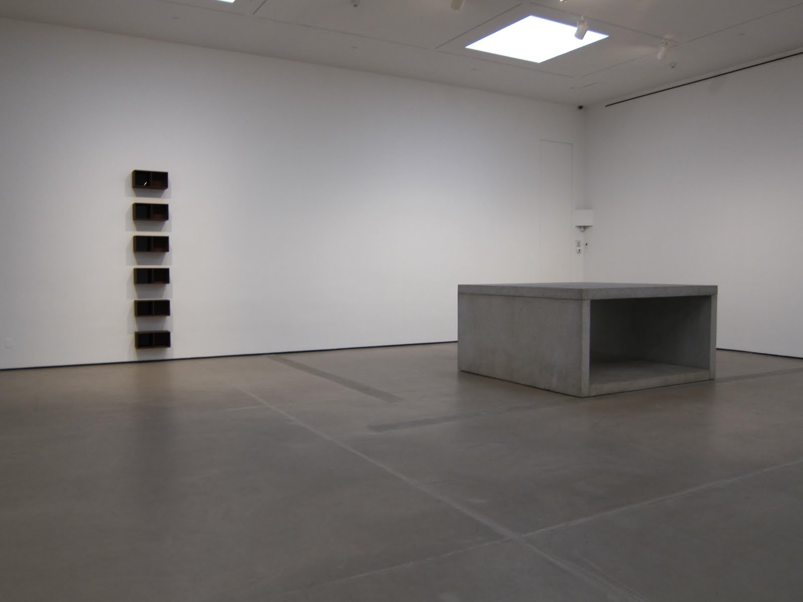
Donald Judd
Donald Judd

Kate Shepherd
Kate Shepherd
Kate Shepherd - although hard to see in these photos, Shepherd has white geometric line drawings on these shiny surfaces.

Friday, August 27, 2010

Anne Truitt


Anne Truitt, originally uploaded by barao_alexandra.

"When I painted a chair recently, I noticed that I put the paint on indifferently, smoothly but without particular attention. The results were satisfactory but not in any sense beautiful. Does the attention in itself with which paint is applied in art actually change the effect of the paint? Does the kind of consciousness with which we act determine the quality fo our actions? It would follow, if this were true, that the higher the degree of consciousness, the higher the quality of the art. I think it likely. Training in art is, then, a demand that students increase the consciousness with which they employ techniques that are, in themselves, ordinary."

~Anne Truitt, February 3, 1975

Wednesday, July 7, 2010

Erasing


Just found this blog "erasing" -specializing in lots of white/high-key and minimal art works. Recommended.

Monday, March 22, 2010

Dylan Stantham

Dylan Stantham (via Dragonaut)

This piece covers a lot of my favorite things in art - elements or images of the natural world, minimalism, asymmetry, and nice surfaces.

Thursday, October 1, 2009

Laura Braciale


Laura Braciale, Crux, 2009


Bevel (side view), 2009, Acrylic on panel with plastic folder holder, 48"h x 60"w

Monday, July 6, 2009

Monochrome Monday

Alfonso Fratteggiani Bianchi, #197 Giallo, 2004, pigment on stone, 30.6 x 27.5 cm
Florence Pierce, Untitled #101 (Black Violet), 8.14.95, Resin Relief, 24 x 24 inches
Daniel Levine, The Morning After, 2003 - 2005, oil on cotton, 34" x 33"

Friday, September 26, 2008

John Zurier Nocturnes

John Zurier
Exile, 2007
distemper on linen
20" x 24"
Night 29, 2008
distemper on linen
30" x 20"
Night 28, 2008
distemper on linen
30" x 20"

Nature’s Light, 2004
oil on linen
48” x 32”

Tuesday, September 23, 2008

Ane Graff : International Guest Artist Interview

I found Ane Graff on VVORK and have been corresponding with the artist recently, discussing her show with Josefine Lyche called "Remake." I love the minimalist form and aesthetic of the current show - elements of which remind me of other great minimalists like Anne Truitt and the glass works of Gerhard Richter:

Gerhard Richter

There's a beautiful elegance to "Remake" (see below) - each object placement and surface treatment has been taken into consideration. Some objects are transparent, others are semi-transparent - they have even gone as far as to include the grid of the celing into their aesthetic. The artists also appear to be utlizing differences in gloss and matte surface treatments to further the subtle variety of the exhibition. The diagonal organization of the objects in the room gives movement to such stable and solid-looking forms. She's also working with some of my favorite colors (slate blue/gray). I would love to see the exhibition in person.

From the press release for Ane's most recent exhibition:

"In the skylight room at Kunstnerforbundet, Ane Graff and Josefine Lyche show their new project called 'Remake'. This project’s starting point was 'Fragments of Fear', an exhibition the duo showed at gallery 21:24 in 2003. 'Fragments of Fear' was made as an installation, consisting of wall paintings and sculpture. Nets and shadows were elements shown in an atmosphere of physical and metaphorical darkness. The works were held in a scale of black and white, the surfaces being both dead and glossy. “Remake” is, as the title implies, a remake of this exhibition. The new installation consists of monumental sculptures and the work shows evident references to minimalist art. The shapes from “Fragments of Fear” are no longer amorphous, but have found their 'gestalt'."

Installation view of “Fragments of Fear”
"Remake"
"Remake"
"Remake"
"Remake"

I asked Ane her thoughts on using multiple media, she wrote,

"After I graduated the Art Academy, I only worked with drawings to specialize and better my technique . After a while, I just wanted to feel free to express my ideas in other medias and not be limited by only one media. This was a process, but I wanted to extend my work and express myself in a wider range. An inspiration for this was Rosalid Krauss` text "Sculpture in the Expanded Field" from 1979 [pdf here]. I felt there were possibilities and issues in my work that weren`t properly adressed solely by working with pencil on paper. I wanted to work with scale, abstraction, and structure in other medias.

One critic here in Norway wrote that my sculptures and photographies are a clear part of my drawing practice. I was very happy about that, because that is the way I feel too. I feel I am working with 'drawing in an expanded field'."

Tell me about how your art career has evolved...

"I graduated in 2004 from the Art Academy in Bergen, Norway. I was working solely with drawings then. Luckily for me, drawings were having a great revival in Europe and I was one of very few young artists who had specialized in this technique here in Norway. In school, I was always told to work with photography, video or new media, and I was very much on my own working with drawings. I guess maybe I was the nerdy girl in a world filled with new media-people! It just goes to show that you should always do what you believe.

I was picked up by the gallery STANDARD (Oslo) right after school because they saw a market for drawings in Europe. This was a great opportunity for me. I was completely clueless as how the business worked and being in a gallery has taught me so much. I would recommend it to others if they get the opportunity. My gallerist is very interested and gives me a great deal of freedom. He has encouraged the process which lead me to work with other medias as well, even though my sculptural works and installations does not generate as much money as the drawings.

Living as an artist in Norway is easier than abroad. We have a lot of government funding and I do have a 3 year working grant. From Dec 1 I will go to Berlin for a year, as I received a residency at Bethanien Kunstlerhaus.

I make sure I have a solo show every year, and at least 4-6 group shows. I have mostly shown my work in Norway, but I do participate in art fairs with STANDARD, such as NADA and Frieze. I guess for next year I will focus more on showing abroad."

ANE GRAFF
"FALL INTO MATTER"
2007

Installation view: "Generation by Division or Separation I and II"


How has the landscape of Norway influenced your work?

"I grew up in the countryside, actually next to the Oslo Fjord. We had a large garden and I always spent lots of time there. So it must have influenced me somehow. I guess the Norwegian scenery is known for its neutral grey/ bluish hues and its serenity. The "soul" of the Norwegian people is said to be quite melancholic and reserved. So I guess that would describe a lot of the art as well. I think Scandinavian art in general is known for its simplicity, its neutral colour-scheme and its willingness to work in a theoretical manner. Ideas before expression, reserve before feeling."

What do you have coming up?

"I will be a resident at Kunstlerhaus Bethanien in Berlin for a year."

Check out more of Ane's fascinating work here. Thanks to Ane Graf for taking some time to share with minutiae and the readers.

Thursday, March 20, 2008

Peter Rostovsky's "Blindness" Series


A somber and sublime series of paintings by Peter Rostovsky. His site states that it is, "A series of landscape paintings created for the occasion of the show "Blindness" at Dwight Hackett Projects in 2005."

Tuesday, February 5, 2008

B. Anderson "Dark Forest Series"


Kasimir Malevich, "Black Square", Oil on Canvas, 1915


I stumbled onto B. Anderson's photography yesterday and I'm a sucker for photography that is related to or inspired by painting (and vice versa). B. Anderson is a Canadian photographer whose "dark forest series - 2005" was especially interesting to me. The statement for the series reads, "This series was first inspired by Russian artist Kasimir Malevich's 1915 painting, "Black Square". The thick, cracked black paint that showed the white canvas underneath made the viewer crave to see the representation that may be shwoing in those cracks. In fact the painting's purpose was to reduce the figurative process to the point where it cancelled itself out."


B. Anderson images from "dark forest series - 2005"

LinkWithin

Related Posts with Thumbnails