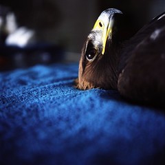
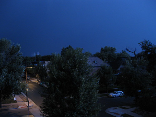
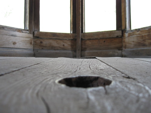
Jessica Hans is selling prints of these three images as small-run and very affordable grayscale goodness - just $25 and $35 each - ppd. She writes, "I'm selling off a very small selection of prints that are in conjunction with my new Golden Dawn series. The three images are available signed, in a very limited edition, all on 175 gsm acid-free uncoated paper. Sales will partially help fund my move to Baltimore in the next two weeks. Please take some time to check out the series as well as the prints for sale."
Monday, August 31, 2009
Golden Dawn - Prints by Jessica Hans
Collages by Cheryl Molnar
 Industrial Park, 14" x 10", oil, paper on wood panel, 2009
Cheryl Molnar
Roofscapes by Jim Maio
Sunday, August 30, 2009
Photo of the Day

Music by Candy Claws - OOP Print

Fort Collins-based band Candy Claws has made one of my favorite albums of the year called "In the Dream of Sea Life." The music was inspired by the Rachel Carson's 1951 classic on marine biology, The Sea Around Us. It is a soft, sweet and glowing album for late summer days. They've recently remastered it and released it on Indiecater Records - where you can stream the whole album and purchase it digitally. Unfortunately, the original release of the album is now out of print, but I got my hands on one when I saw them play in Fort Collins. It came in a DVD case with a 12-page art booklet, a sticker, and a handmade art print. I've scanned the print to share with you:

Catamaran from Candy Claws on Vimeo.
Saturday, August 29, 2009
Friday, August 28, 2009
Bear and Ladder
 Bear climbing out of a skate park in Snowmass, CO - photos by Tina White - at the Denver Post
Nosaj Thing live show
Embrace!-ing


I'm looking forward to the upcoming site-specific installation exhibition at the Denver Art Museum called Embrace! You can read about the show here (pdf). I took these photos on Tuesday - showing progress being made by artist Nicola Lopez.
Thursday, August 27, 2009
Four by Bill Travis
 Bill Travis, Nocturne in silver and blue, photographic transfer on board with pastel and mixed media, 2006.
  Bill Travis, Edgar’s view, photographic transfer on board with pastel and mixed media, 2006.
Read about the work in this New Partisan article - and visit the home page of Bill Travis here.
Wednesday, August 26, 2009
Annie Marie Musselman - Finding Trust

What a striking and beautiful photo -taken at the Sarvey Wildlife Rehabilitation Center. The entire series, "Finding Trust" is really touching.
See also this Jen Bekman post on Musselman's work and Musselman's own site.
Three Signs
 Nathan Coley, There Will Be No Miracles Here, 2006
Music For Your Studio; Vol. 27

Their site describes this release as "Following debut tape released on Not Not Fun records, this cassette shows High Wolf looking at Africa from his native Amazonia...What's the difference between Amazonian and African jungles? When we live in the wild, with percussions and tribal singing, we're all the same..."
It is mostly hushed, meditative loops - as one guy on twitter put it, "Drones, tribal beats, loops, temple chime tones. sweaty and equatorial." Some of the better stuff I've heard in this genre.
Their myspace page has the album up for free download. The cassette is sold out.
Tuesday, August 25, 2009
Monday, August 24, 2009
Kris Lewis at David B. Smith
 Kris Lewis, "Low Tides", Oil on Board, 36x24"
 Kris Lewis, "White Flag", Oil on Board, 36x24"
Interestingly, the stripe on the left side of this painting was painted over to be a aspen trunk -which is how it was shown at the gallery. That must have been a late decision because this is the only version I've found of it online.
Sunday, August 23, 2009
Found Photo of the Day
Saturday, August 22, 2009
Three Fallen Trees

 Charles Ray, "Hinoki", 2007
photos from the Art or Idiocy? photoset of the new Modern Wing of the Chicago Art Institute
This decaying tree was cast from the original in fiberglass, then the copy was shipped to Japan where it was replicated through hand-carved Japanese cypress wood. Read more about it here.
 Nathan Abels, "Monument", Acrylic and Oil on Panel, 2x3', 2008
Friday, August 21, 2009
Select Recent Photos by Me
Thursday, August 20, 2009
Guest Artist; Eric Lo Presti
"Thanks to Nathan for inviting me to share my thoughts on his blog. Nathan and I share a number of aesthetic interests, including a love of aerial landscape imagery, so maybe it is appropriate that I started writing this entry while on an airplane, high over the Atlantic. My wife and I were returning from a trip to Denmark, where we attended a friend’s wedding, and London, where we checked out some East-end galleries. So my head is full of Danish modernism, Brick-Lane curry, and the art I saw on my travels.
Now that I’m back in NYC, I’m in crunch-mode, starting the final few paintings for my upcoming show (entitled Fade, opens Sept 11 at Like the Spice Gallery. This work is about the desert, and my feelings about growing up in the waning aftermath of the Cold War. I’m using aerial imagery of desert weapons sites, e.g. Nevada Proving Grounds and the Hanford Site in Eastern Washington. I’ll start out with a couple shots from my studio, so you can see where I’m coming from:
 (seen in studio below Yellow Plume; Laser Interferometer Gravitational-Wave Observatory, Oil on linen, 2009. 60 x 40 inches)
My studio, last I looked, including a blank canvas waiting for my input. Following are my thoughts, in no particular order…
1) Color

The underlying theme in all of my work is color, and the colors I’m thinking about now are the colors of the desert steppe in southeastern Washington State, where I grew up. The steppe is huge, punishingly hot, and desolate – all of which I find beautiful. Two interesting things about the steppe around my home town:
• The dunes were formed by massive cataclysmic floods
• It is home to the Hanford nuclear site
In other words, the landscape was formed by two major traumatic events, one natural, the other man-made. The pictures above give you an idea. The white structures are giant sand dunes kicked up by the last massive flood around 14 thousand years ago. The natural colors revolve around the grays of the sandy landscape, with ochres, atmospheric mauves and the crystal blue of the desert sky.
2) William Turner
 J. M. William Turner (1775-1851), A Stormy Coast, circa 1820-30, Gouache, pencil and watercolor on paper, 27 x 45 cm, Tate, London
 J. M. William Turner (1775-1851), Sunrise, circa 1825-30, Watercolor on paper, 33 x 47 cm, Tate, London
While in London, I was lucky enough to catch a show at the Tate Britain which matched up the more abstract work of William Turner with Marc Rothko. You can’t talk about color in the landscape without talking about Turner, known for abstracting his vistas into vibrant, impressionistic swirls. I was particularly taken by a couple of pale but lively watercolors.
3) Gerhard Richter
 Gerhard Richter, Mustang Squadron (Mustang-Staffel), 1964. Oil on canvas, 34" x 59", The Museum of Modern Art, New York.
 Gerhard Richter, 866-2 Abstraktes Bild, 2000, Oil on canvas, 78” x 63”, Miriam Goodman Gallery, New York
I work simultaneously with representational imagery and abstract fields of color, and it won’t surprise any of my peers that Richter is a big influence. Richter demonstrated that one could combine these two distinct and seemingly oppositional aesthetic modes within a consistent conceptual framework. My work essentially builds off of the same idea, although, of course, my paintings come out looking quite different.
3) Dark Sun: The Making of the Hydrogen Bomb, by Richard Rhodes
 While researching my show, I read this outstanding book. It tells the genesis story of the development of thermonuclear weapons in gripping, dramatic, and sometimes terrifying detail. Some of that development took place at the aforementioned Hanford site; engineers at Hanford created the plutonium for the Nagasaki bomb and for the US arsenal throughout the 1950’s and 60’s. Although the site was switched over to environmental cleanup in the 80’s, the remains of the nuclear hey-day are still scattered throughout the landscape in the form of decommissioned reactors and waste burial sites. Above is an image I took of sealed submarine reactors being buried in the dunes, an indication of the vastness of the cleanup/decommissioning effort.
4) Department of Eagles – in Ear Park
 The sparse, low sound of this album became something of a soundtrack for me in the studio this year. I like the DoE’s directness, and their use of a few rich sounds within simple, minimalist compositions. Music can be hard to describe in words -- the sound either hits you or it doesn’t. In that way it is a lot like color.
5) Chromophobia , David Batchelor

David Bachelor, Eyeball 4 (pink), 2007, 30 pairs plastic sunglasses, 30 cm diameter, Wilkinson Gallery, London
If you’re an artist thinking seriously about color, you are going to love this book - Chromophobia, by David Bachelor. The basic thesis is that color has been marginalized by western culture, in favor of a puritanical concept of white or whiteness. (Think of the supposedly neutralizing aura of a white cube gallery, or the Orwellian quality of the interrogators bare white light bulb.) I’m still caught up in a quote from the second chapter, where Batchelor quotes the 19th century French Critic Charles Blanc:
The taste for colour, when it predominates absolutely, costs many sacrifices; often it turns the mind from its course, changes the sentiment, swallows up thought.
Blanc seems to have meant that comment negatively, that color is a perversion, a deviation from some kind of true path in civilized art (no doubt represented by the linear, narrative styles espoused by French Academies at the time). But to me that quote sounds like a step in the right direction, especially the ‘swallows up thought’ part. After reading his book, I was gratified to see the chroma-friendly sculpture by Batchelor, pictured above, which is made out of bright pink plastic sunglasses.
6) Tillman Kaiser

 Tillman Kaiser, Untitled, 2009, Tempera and silkscreen on canvas, 55 x 40 cm, Wilkinson Gallery, London
 Tillman Kaiser, Untitled, 2009, Tempera and silkscreen on canvas, 55 x 40 cm, Wilkinson Gallery, London
I’ll round up this blog entry with some work I saw Wilkinson Gallery, in London’s East end. The artist is Austrian, educated in Vienna, and hasn’t quite yet made the jump across the pond. His paintings somehow manage to reference Salvador Dali via an angular, modernist style which reminds me of Mark Grotjahn. Anthony Wilkinson was nice enough to pull out a couple of recent works on canvas. The first image is of two of the smaller paintings leaning against the gallery’s back-room windows, which overlook the street below."
Eric LoPresti is an artist living and working in New York. More works from his upcoming show are available on his web site at www.ericlopresti.com.


